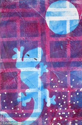
 Sometimes your gelatin print or any mixed media piece just needs that extra pop to make it come together. Today I share with you a few tips on how I get my monotype prints to stand out:
- Use bright pigment rich colors to start with because as you layer the colors they can mix and become dull. (This will depend on what inks/paints you use.)
- Try to keep a good range of values from very light white to very dark black.
- Look at your print and ask, “Could I add an extremely dark or light mark to bring it all together or finish the print?”
I did this in the ICAD print on the right-
- I used unmixed colors just out of the tube. (you don’t alway have to do this)
- The range of value is pretty good from light lights to dark darks
- Then I added the black marks for the eyes with a sharpie and the white dots with a corrective pen.
- I think these tiny marks kind of balance off the bold shapes of the rest of the piece.
If you have not watched my recent video about masking stencils and layers when gelatin printing, then please check it out here.
Happy Printing!
This was such great advice! I am counting the days til my gelli plate comes it. Off to watch your video!
I was typing you an email as this came in. Too funny!
I want to experiment with using different values of the same color before laying on the next color, such as what you’ve done with blue in the example photo. It seems like that gives some good dimension and interest to the image.
Love your website!